Redesigned Keka's Pulse Survey
Redesigning Keka's Pulse Survey to help HR understand employee well-being—while rebuilding the feature from the ground up.

In May 2023, I joined Keka's newly formed design team. Leadership had just launched the Employee Experience module to help client organizations boost employee engagement. My first project? Redesign the Pulse Survey and increase its adoption rate.
Understanding the Pulse Survey: A Simple Dive In
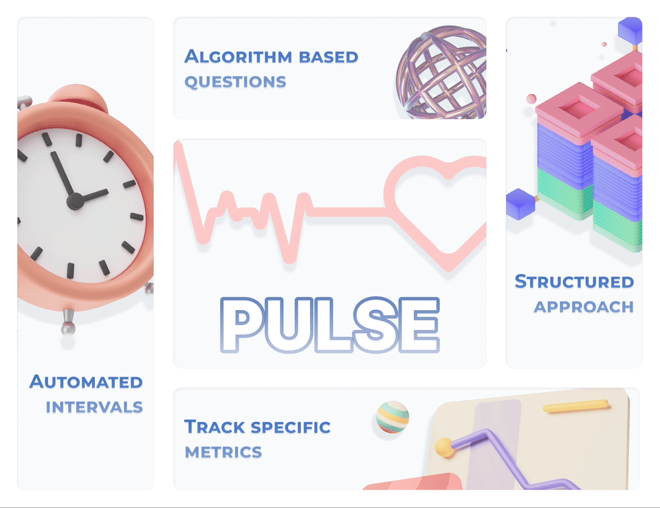
Let's start with what a Pulse Survey actually is. It's an automated survey that runs regularly—daily, weekly, or monthly—to track specific metrics. Think of it as a compass for HR, pointing out areas that need improvement.
How is it different from a regular survey? Pulse surveys are focused and automated—they use algorithm-based questions to zoom in on specific metrics. Regular surveys, on the other hand, let HR customize their own questions.
Addressing HR's Need: The Problem Statement
The core problem? HR needed a better way to understand how their employees were feeling and assess overall well-being in the organization.
Goals: The HR and Business Challenges We Tackled
To identify user pain points, my product manager and I dug into customer tickets and user analytics to understand the core problem.
- HR:
- Limited analytics
- Challenging to understand crucial metrics
- Difficulty gaining comprehensive insights into employee engagement and organizational dynamics
- Employee:
- Lengthy surveys
- Time-consuming ordeal
- Demands considerable effort
- Often results in lower participation and engagement
- Business:
- Low adoption rate of Pulse surveys
- Hinders ability to gauge employee sentiments
Navigating the Chaos: Our Design Journey
The Employee Experience module was new territory for us—a bit like walking through a storm. But my Product Manager and I jumped into brainstorming, determined to bring order to the chaos. We knew competitors had their own takes on Pulse surveys, with only a few using them as intended. We wanted to create something better.
Our journey unfolded in four distinct steps:
1. Research and Brainstorming:
We started with research and brainstorming, exploring the Pulse survey landscape and understanding its complexities.
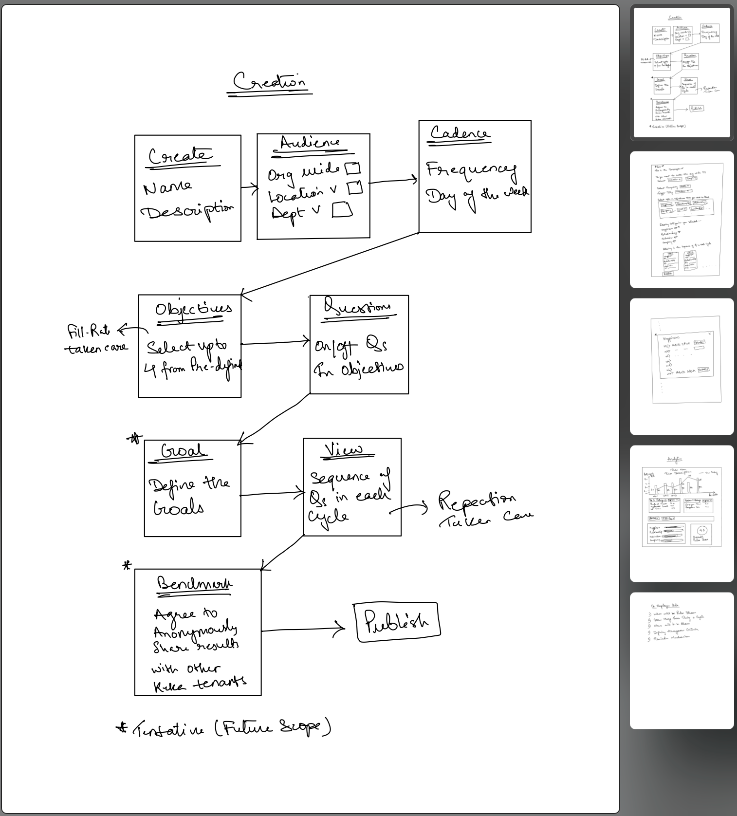
2. Wireframing:
With those insights, we created wireframes—a blueprint for the redesigned Pulse survey's structure and functionality.
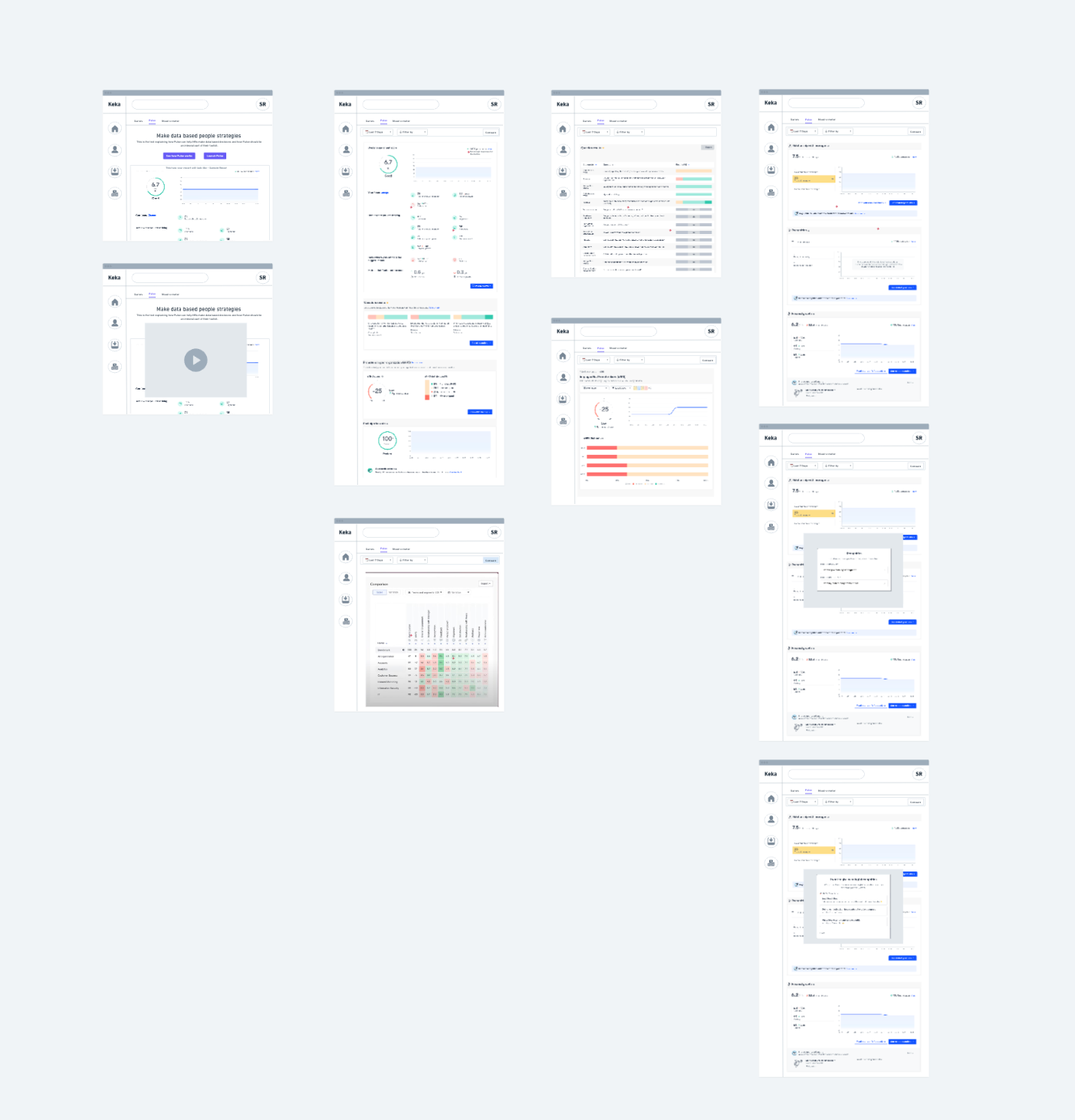
3. Visual Design:
Using the wireframes as our guide, we moved into visual design, bringing the survey to life with a clean, engaging interface.
Persona HR
- Limited range of metrics for comprehensive tracking.
- Lack of filtering capabilities based on department or other criteria, hindering the ability to concentrate on specific results.
- No straightforward comparison options, making it challenging to analyze and contrast data effectively.
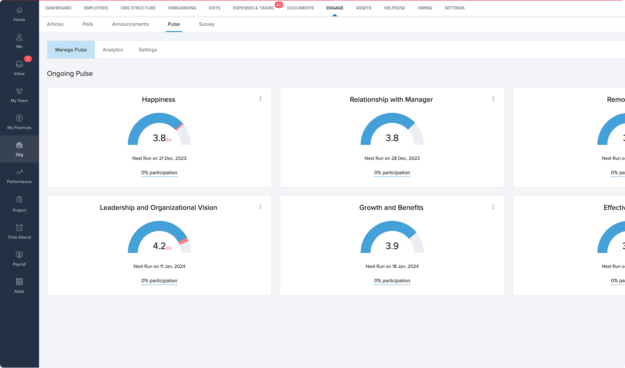
Persona HR
- Expand available metrics for comprehensive tracking.
- Implement filtering options based on departments or other criteria to target specific results.
- Introduced user-friendly comparison features for easier analysis.
Persona HR
- Facilitating easy cross-departmental comparison will aid HR in enhancing overall organizational well-being.
Persona HR
- The visual representation of the chart fails to provide a clear understanding of areas lacking happiness.
- A simple bar chart with sub-metrics makes it challenging to make informed decisions.
- Visualizing question comparisons lacks clarity and ease of scanning.
Persona HR
- Clearly separate sub-metrics to enhance understanding of the specific areas affecting the overall metrics and to identify trends around the metrics.
- Make it easy to scan through question-based results for improved accessibility and comprehension.
Persona HR
- Employees receive a form pop-up when they open the Keka website for certain tasks. This can be annoying, leading to a drop in form completion rates.
- The "CLOSE (X)" call-to-action has low visibility, making it difficult to notice.
- The design lacks engaging elements, making it challenging to keep employees motivated to fill the form again, especially since it appears frequently.
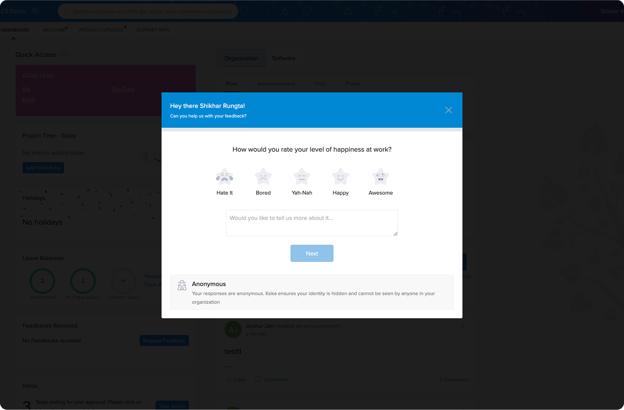
Persona HR
- Instead of directly filling out a form, we changed it to a small pop-up on the side with clear options to START or DISMISS.
- To encourage clicks on START, I made the button wider and added an emoji to hit employee's curiosity.
- Once they click, I added a GIF and small interactions while filling to make it more engaging and give a dopamine boost. So they come again for more.
Challenge: Rebuilding from Zero to One
The biggest challenge? Rebuilding the Pulse feature from scratch. It was a journey from zero to one—exciting, intense, and it brought everyone together to solve the problem.
In the end, the redesigned Pulse Survey not only boosted its adoption rate but also became a key part of enhancing employee experience.
What Changed?: Design Impact
Boosted adoption rate to 21%
My Learnings
My most significant takeaway from building this feature was learning to collaborate with individuals at various levels, including the CEO, to shape the feature into what it is today.